Website Case Study – Russell Books Online
Project Overview
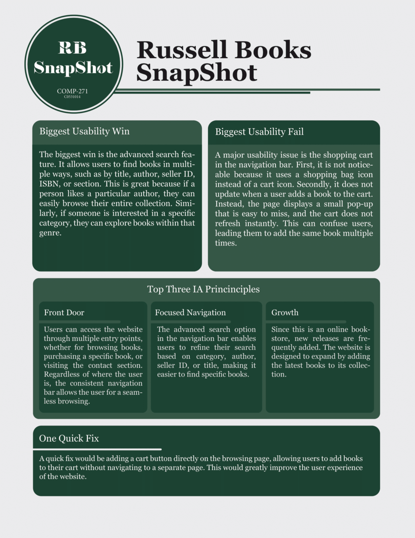
For this case study, I analyzed the Russell Books online store using a combination of Jakob Nielsen’s Usability Heuristics and Information Architecture (IA) principles. The goal was to evaluate how user-friendly and effective the website is from a UX perspective and identify areas for improvement.
Evaluation Process
I explored the site as a first-time user and reviewed the layout, navigation, interaction flow, and visual clarity. Based on my findings, I created a ranked list of issues — starting from the most critical usability problems to minor design flaws — along with a summary of the features that worked well. This structured approach helped highlight both strengths and weaknesses of the site.
Findings
The website has several usability issues that affect the shopping experience. Users can’t add books directly from the browsing page, which adds extra steps. The cart icon is unfamiliar and not easily recognized, and there’s no clear way to see how many copies of a book are available, which can lead to confusion during checkout. Overall, the site could benefit from clearer feedback, more efficient navigation, and better error prevention to improve the user journey.